Blocmarc

Blocmarc

Summary

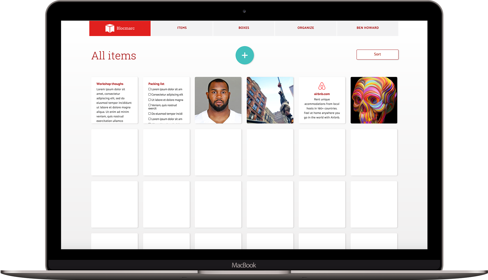
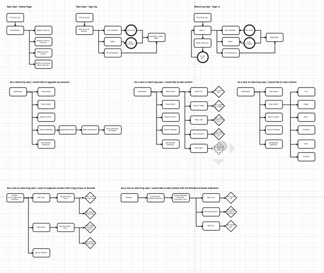
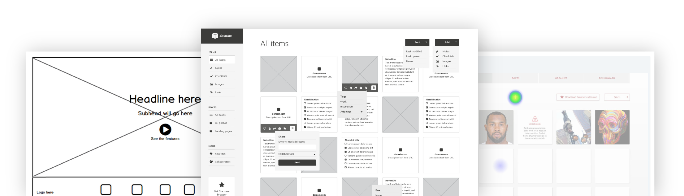
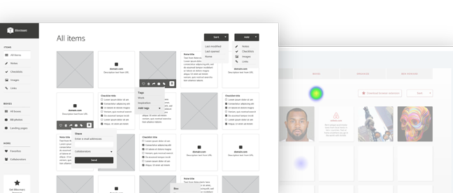
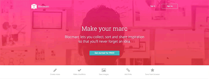
Saving inspiration on the web can be difficult. Blocmarc wants to give users an easy way to create text and collect images and links so that they’ll never forget an idea. I researched, designed and developed this prototype for my Bloc Designer Track project.

Problem

Most web apps for note taking are too complicated – there are more options than are necessary to record inspiration. The end result is a cluttered experience that makes finding content cumbersome and confusing. Blocmarc strives to give its users a simple, clean and effective way of saving ideas on the web.

Solution

Through comprehensive user research, competitive analysis and user testing, we created Blocmarc: Never forget an idea. Our process (detailed in the next section) found that our users wanted a quick way create, save and share content (notes, checklists, images and links) on their mobile devices and computers.

Blocmarc

Process

The path to Blocmarc consisted of a detailed and careful study of user research, competitive analysis, user personas, user stories/flows, wireframes, mockups, branding, prototypes and user testing – all with various iterations:

User research highlights

86%

News (86%) and social networks (86%) are the most popular content types by a large margin.

78.6%

Browser access will be key for the success of Blocmarc as most respondents use their browsers to save content (78.6%). Many respondents commented that browser bookmarks can become cluttered and confusing.

Sync

Respondents commented that they would like an app that could sync across platforms, offer better organization and the ability to check off notes – not delete – once they’re finished.

85.7%

85.7% of respondents said they would be open to paying for a service that organized their digital documents. 77.8% of those willing to pay would commit $5-10 per month.

Competitive analysis

An analysis of market competitors Evernote, Google Keep and Quip found that Blocmarc’s experience should be a sweet spot between Google Keep and Evernote. The intuitive interface and features of Keep combined with some of the Evernote utilities like web clipper could meet that goal without making the app feel bloated.

User personas

Three users with distinct roles were interviewed about their motivations, goals and frustrations. Save and searcher Alex often forgets that note-taking apps are availble without a browser widget. Distributor Mary would like a checklist function that tracks her progress. Gatherer-sharer Liz needs storage for large documents.

User stories and flows

Detailed paths for creating content, onboarding and signing in were detailed for new and returning users. This detailed information architecture served as a template for the creation of the site.

Branding

Before jumping into the design and layout of the app, we established the overall look and feel of the brand. That included choosing fonts for headlines and body type – Roboto Slab and Catamaran. Roboto was chosen for its versatility as it has a mechanical skeleton but features friendly and open curves. The hard angles of the font align with boxes and toy building blocks, which give the type face a playful characteristic. We chose this red color scheme mostly to differentiate Blocmarc from its competitors. Evernote is Green, Dropbox is blue and Google Keep is yellow, so we wanted to stay away from those colors.

Logo

The Blocmarc logo underwent many sketch iterations before the right icon was chosen. In the end, the current logo was selected for its versatility and modern feel. The combination of a bookmark and a box was just the right touch.

Wireframes

Low-fidelity wireframes were created, tested and experienced many different iterations before graduating to the the high-fidelity stage. The first round of testing took place on Peek, where random users were asked to complete a specific set of tasks. A usability test script was then developed and three users completed video usability tests on a clickable prototype. Overall, the three users had a positive response to Blocmarc and were able to navigate the site smoothly. The biggest stumbling block was the “Summary” button on the My Account page. All three users were confused about where to go to view a summary of their Blocmarc account. So, we fixed that problem by changing the title of the button to “My Account.”

Mockups

After we were satisfied with the architecture of the site, we began the process of bringing Blocmarc to life. The first step was applying color and images to the layout. Computer and design-themed images were used for the backgrounds, and custom illustrations were made for the home page. Next, we built a clickable prototype on inVision that we used for multiple user testing experiments including UserTesting videos, five-second tests, nav tests and preference tests. The biggest discovery through testing was that users weren’t finding the “add” button as quickly as we wanted. So, we transformed the add button into a circle with a “+” and placed it in the center of the screen. The results from the final nav test showed a 90% success rate:

Prototype

Finally, after we were confident in our user experience and interface, we began to build the html, css, javaScript and jQuery for Blocmarc. The building process stayed true to the final iteration of the design. We waded into unfamiliar javaScript territory with the sticky navbar, but through research, trial and error and dogged determination, we found a solution to our coding problems.

Conclusion

Blocmarc accomplishes its goal to give users a quick and easy note-taking experience. Through many testing sessions and design iterations, we developed a user interface that is simple to use and easy to navigate.

User testing provided crucial feedback for our process. Being able to watch users actually use the site provided valuable insight that we immediately put into action, like the add and account buttons.

More importantly, we were validated by the positive responses to Blocmarc. Words used during testing like “trustworthy,” “modern,” “clean” and “easy” confirmed that our experience was a positive one for users.