Premium
Magazines
Summary
Starting in late 2015 through 2016, I art directed and designed a series of Pittsburgh Post-Gazette premium magazines that covered sports and entertainment in Pittsburgh.
Starting in late 2015 through 2016, I art directed and designed a series of Pittsburgh Post-Gazette premium magazines that covered sports and entertainment in Pittsburgh.
I was challenged with creating brands on specific verticals while giving advertisers a new avenue to reach their customers.
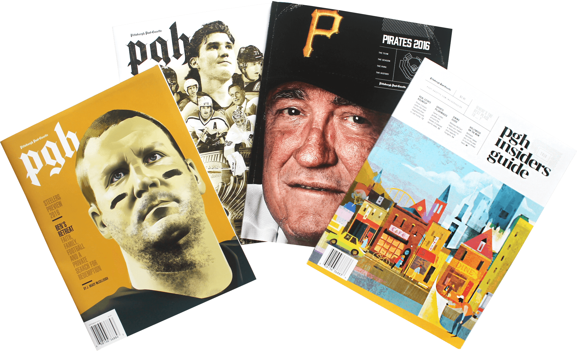
I teamed up with a group of editors to produce four premium magazines in 2016 – The PGH Insiders Guide, Pirates 2016, Steelers 2016 and Pens 50 – in which I built a cohesive and contemporary brand identity.
Initially, the PGH Insiders Guide was meant to be a one-off magazine with no plans of publishing additional editions. However, that project evolved into a year-long series created by dozens of reporters and photographers, a handful of editors, two artists and me.
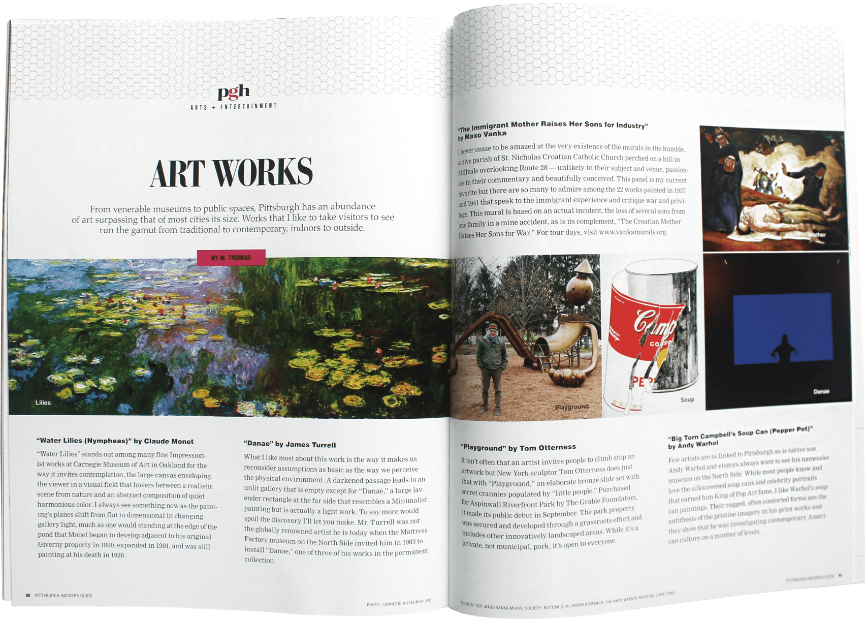
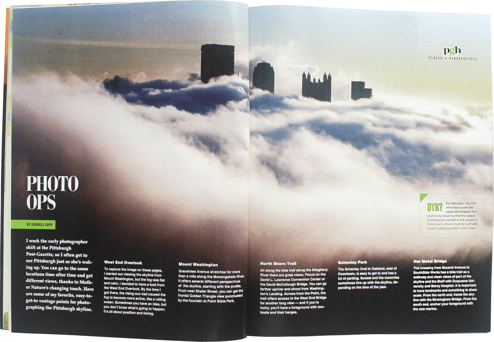
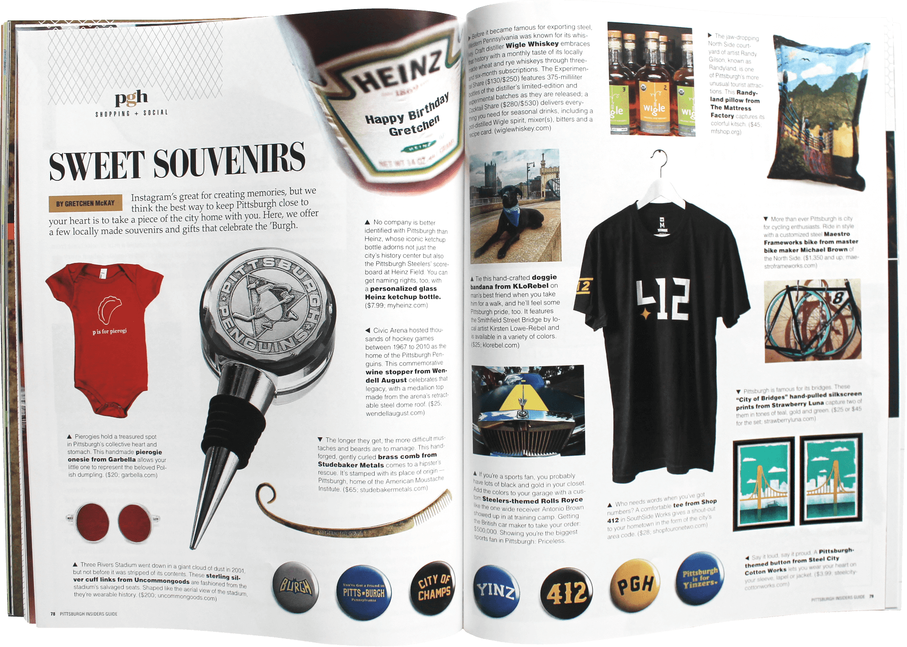
The first in the line of premium magazines, PGH Insiders Guide led readers through the can’t-miss attractions and best-kept secrets in Pittsburgh. It featured everything from the best viewpoints of downtown to quirky foods to sports relics to museum hidden gems and so much more.
I worked with editor Bob Batz Jr. to mold the magazine into five sections, each of which featured a unique design motif. Art direction for the project included teaming up with photographers Andrew Rush and Matt Freed to design and execute pizza and beer photo shoots (easily the highlight of the project).
I collaborated with artists Daniel Marsula and Ed Yozwick to reimagine illustrations of our downtown skyline and neighborhoods. Overall, the magazine spoke to the vibrancy of the city while educating Pittsburghers, old and new, on the town they love – n’at.
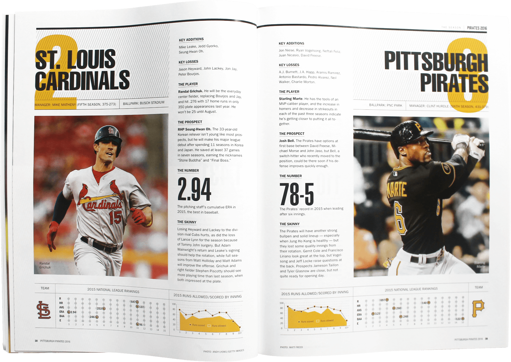
On the heels of their third consecutive playoff appearance, the Pittsburgh Pirates entered the 2016 season with high expectations. At the Post-Gazette, we wanted to capture the excitement buzzing around the team with a season preview stuffed full of in-depth reporting, player profiles, statistical analysis and historical perspective.
The design for this project started with a grid motif created to lead the reader from the cover to the back page of the magazine. For the cover, I collaborated with photographer Peter Diana to create a gritty image of the Pirates manager that accurately portrayed the trials and tribulations of the coach’s life and career.
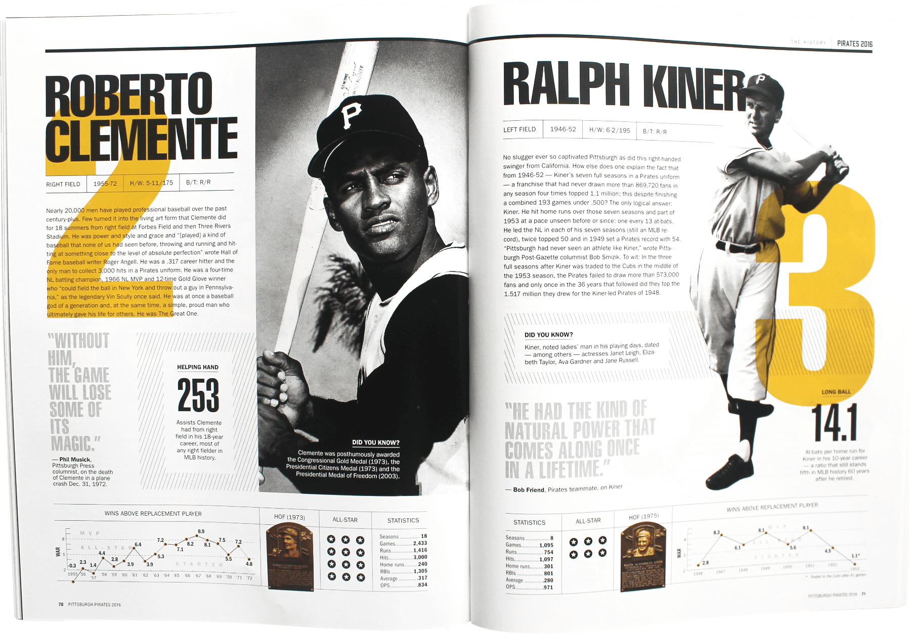
A highlight was creating the Greatest Pirates of all time. I gathered stats and information on each player, dug into the photo archives then packaged everything together for a presentation that was honored by the Society of News Design with an Award of Excellence for inside page design. The book itself also won a SND Award of Excellence.
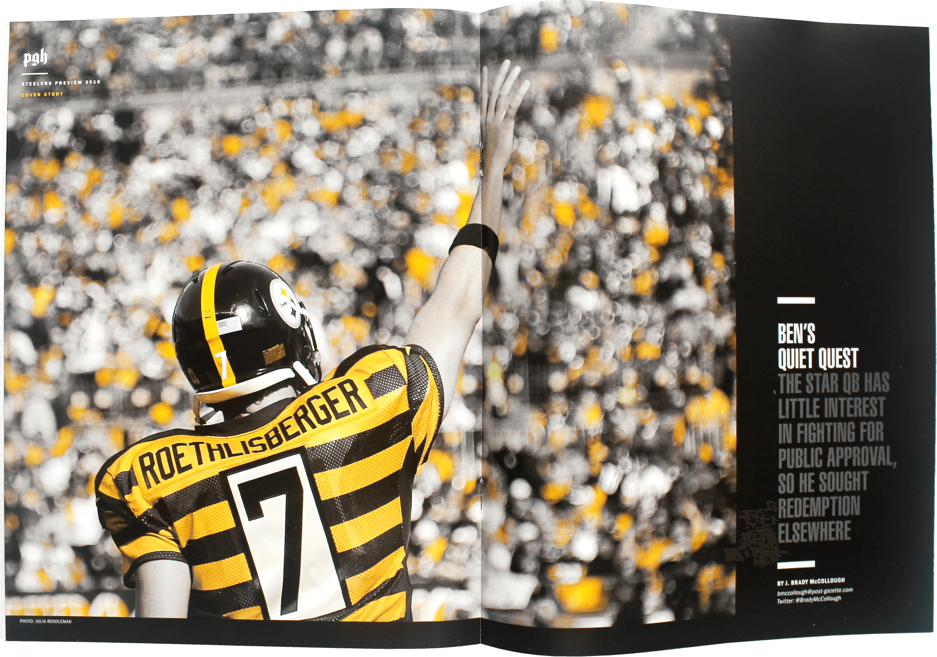
With the editorial success of the PGH Insiders Guide and Pirates 2016, the Post-Gazette doubled down on their premium magazine interests by committing to three more publications for the calendar year. Of course, the logical next magazine topic would be the Steelers – Pittsburgh’s most beloved and decorated sports franchise. But before starting production, we decided that the next three magazines should be tied together by a brand.
After sketching out many iterations on a logo, we settled on the lowercase gothic “pgh” to carry the identity for the rest of the magazine series. The logo is recognizable to our audience as it features the same font as the newspaper masthead. However, the all-lowercase lettering gives the brand its own fresh feel. For the overall design motif, I combined the condensed serif font from the PGH Insiders Guide with the grid motif from Pirates 2016.
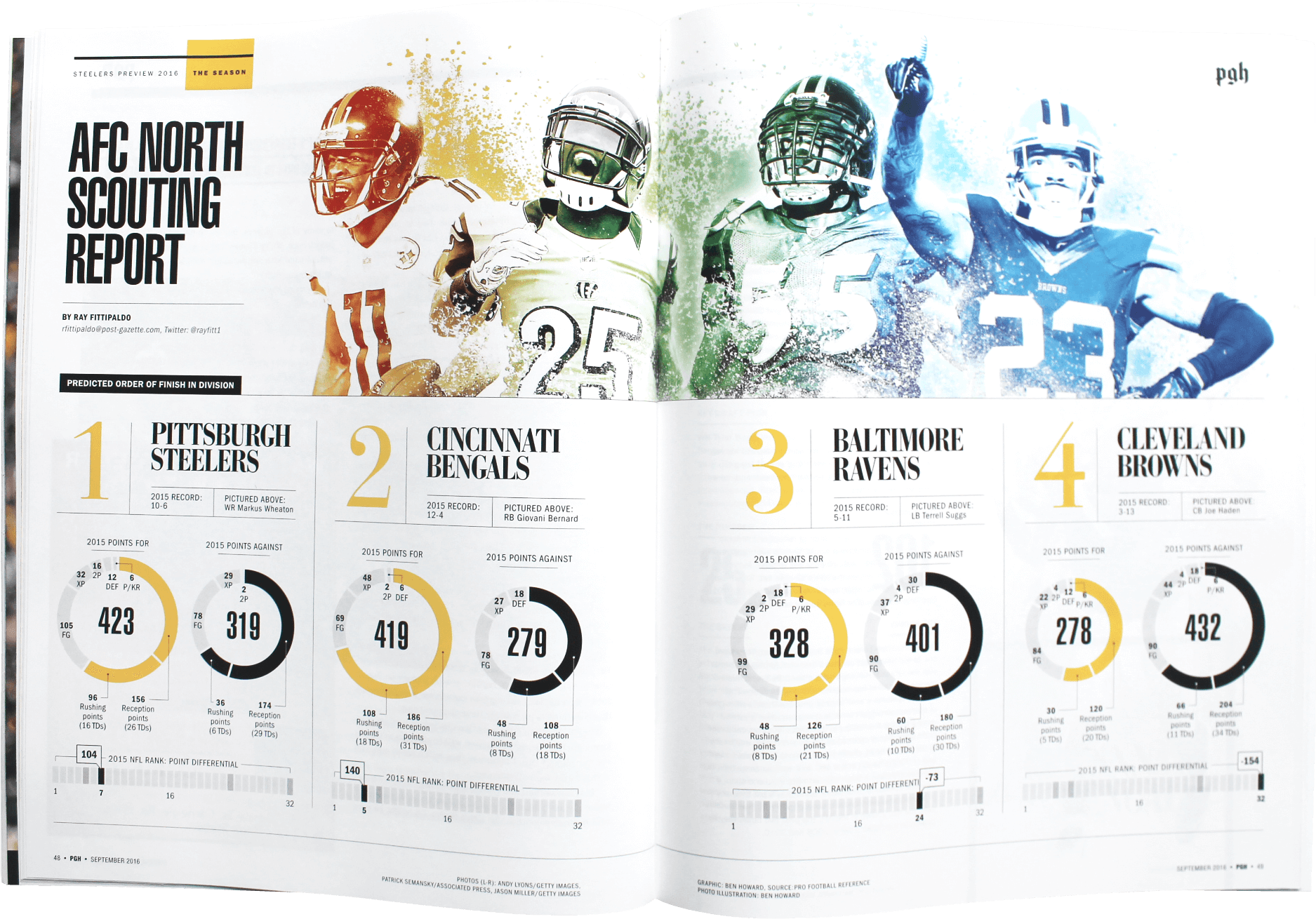
I dug in deeper with statistical analysis to create data visualizations on the players, teams and trends featured in the magazine. Artist Daniel Marsula gave us a striking cover that paired perfectly with the cover story’s theme of redemption. Overall, the first of the ‘pgh’ series built upon the earlier premium magazines and created a solid foundation for those to come.
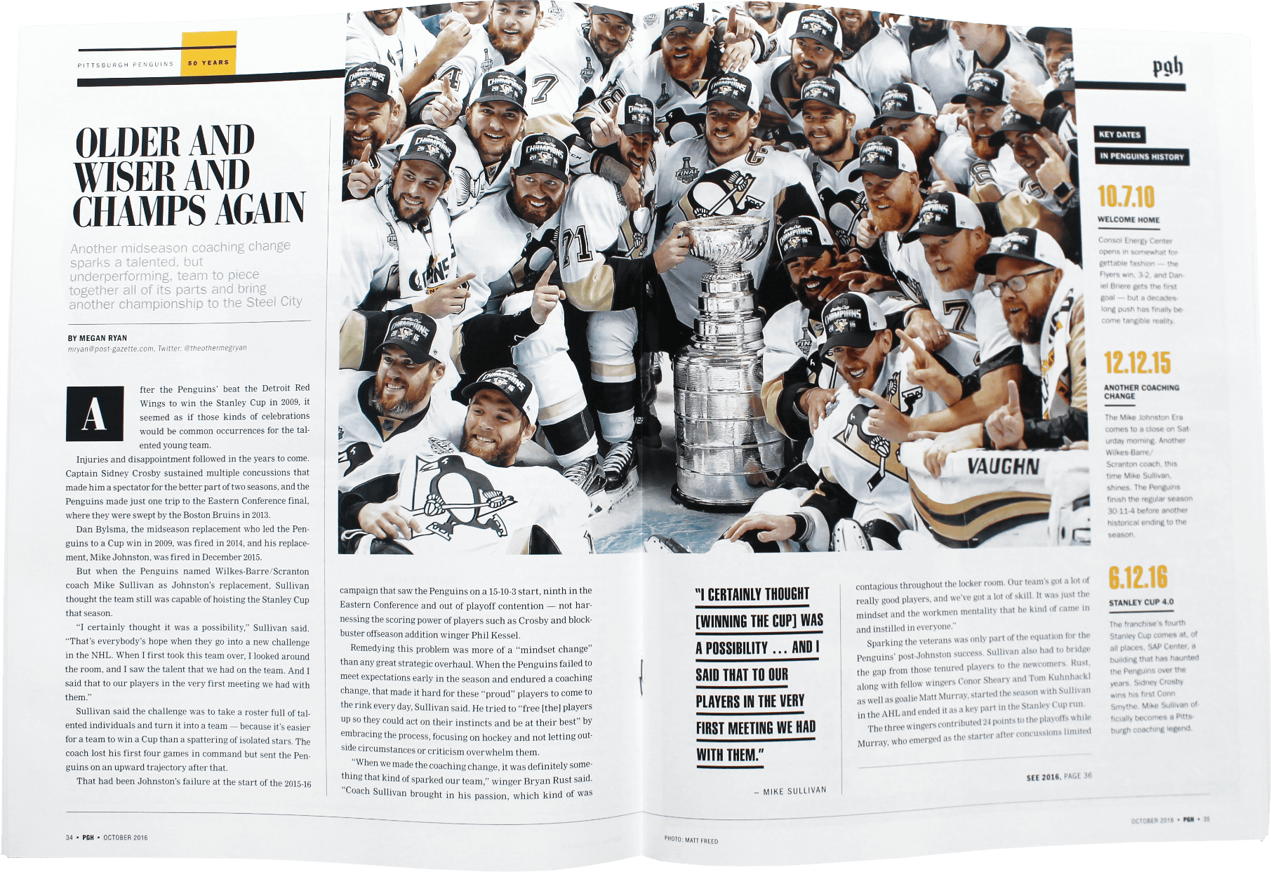
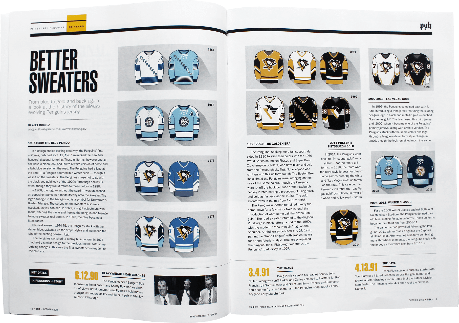
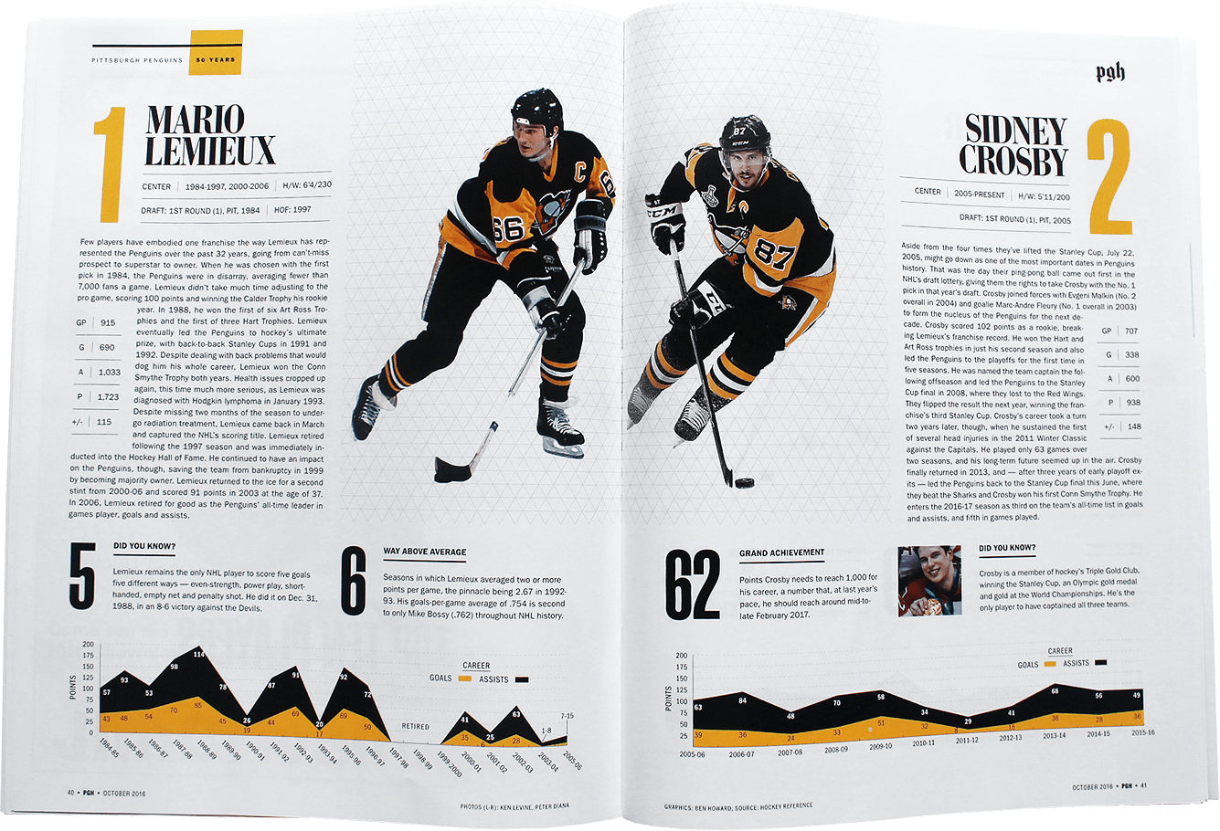
The second issue of the ‘pgh’ series completed the Pittsburgh sports triumvirate with an in-depth look at 50 years of Penguins hockey. With the brand identified and all design motifs in place, this magazine came together much more quickly than the previous three. The template created by Steelers 2016 allowed for continuity and brand recognition in the book. That gave me a chance to work more on the cover, which featured a collage of the greatest Penguins of all time propped up by the Stanley Cup.
Despite the fact that this year-long series did not start out as a series at all, there is a high level of continuity that binds each magazine together. The design elements, typography, photography and illustration show consistency that, in the end, created a strong style. The premium magazines presented an exciting opportunity for me to create a brand and build upon that identity throughout the year.